
Design for Wiener Linien – creating an analog totem connecting digtial and analog offers of the WienMobil app
Simple and accessible
As WienMobil is connecting public transport with flexible sharing, the signpost is connecting the app with the city. Simple but visible.
It is using the dna of Wiener Linien station´s , but looking different as there are no panels or digital monitors. The circular dots taken from the app are presenting the sharing offer on white background in high contrast to the red primary color.
In inclusive design terms this seperates the WienMobil pole from a Wiener Linien station.
Urban Environment
The simple and minimalistic shaping creates a strong and visible mark in a versatile urban environment. No matter where, it is noticeable in every neighbourhood.
Embedding Organisations
For people with disabilities, especially visually impaired, every hard edge is a slap in the face.
This leads to a big fillet on every edge of the WienMobil totem. It is part of a visual guiding system fullfilling every international standard.
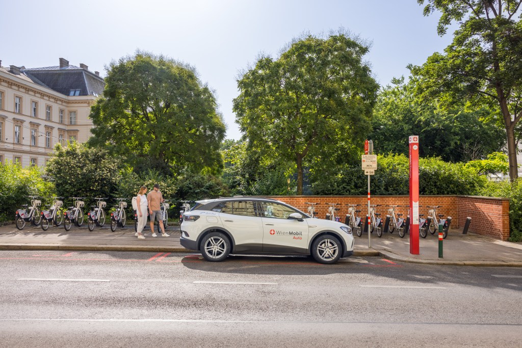
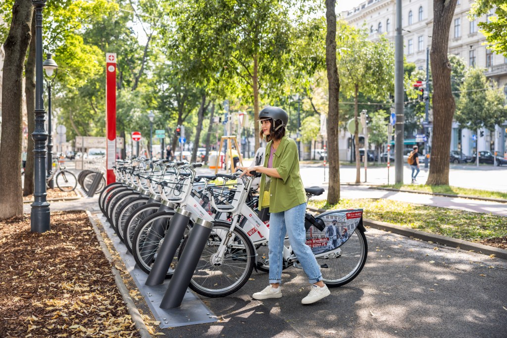
Bikes, e-bikes, cargo bikes next to electric car´s – the offers of WienMobil is growing an spreading around the city of Vienna. This makes sharing accessible and multi modal transport possible – also if you don´t own a bike or are new to the city.
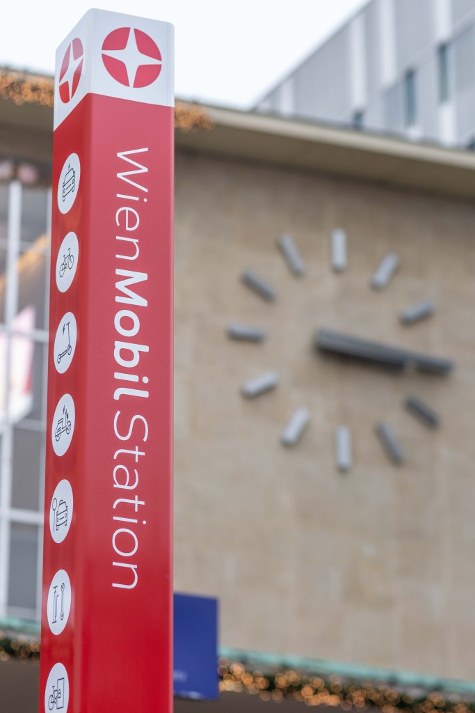
Icons of WienMobil offers & the WienMobil sign are placed on the very top of the totem.
The name of the station is used to create contrast on eye level.

Client
Wiener Linien
Task
Design & Bidding Documents
Ewald Neuhofer
Projectmanagement
Matthias Scheid, Roman Pfatschbacher
Pictures & Commercial
Severin Wurmig severinwurmig.com
