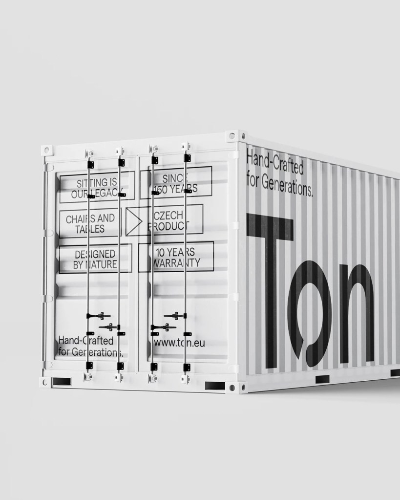
Design for Ton – executing a rebrand process by creating a new visual identity
Destilling 160 years of tradition in a few simple lines
The new Logo will loose a chair, but gain a circle.
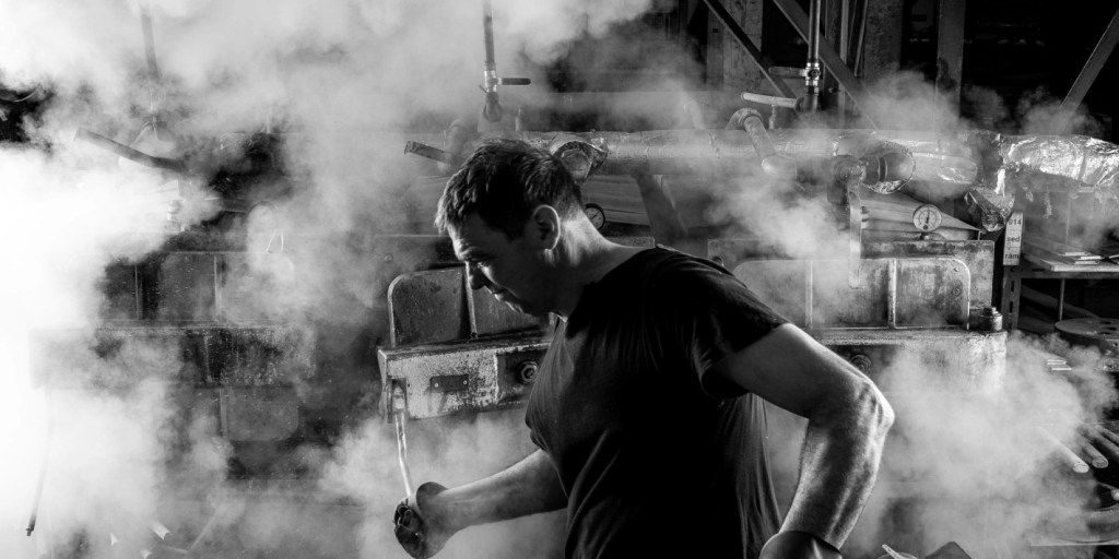
Visiting a company, inhaling the history of a place and it´s people is crucial for starting a journey like this.
By visiting this company it was clear that there is a ton of inspiration for the process.
At the beginning it was all about creating a new identity by changing the existing trademark. My work was initiating a whole new iconic visual world done by Buero Nardin.


Sádlik Machine
The iconic Nr.14 was a part of Ton´s visual identity for a long time. The broken circle will still be a reference to one of its structural parts, so Nr.14 is still a part of the future.
This machine was one of the main inspirations in transforming the “o” into an circular object. Loosing the chair as a visual sign means gaining space and identity for the coming years. Ton´s identity is naturaly growing as trees are getting higher.
The o, or the circle
The letter “o” or the circle is a sign for the people´s daily work in the company, keeping it together – getting it done. Heat and power in contradiction to an almost normative digital world.
Adding a “Hacek” (Caron) like element wich breaks the inner circle means adding a little error. It is a reference to czech type design but also to the uniqueness of every handmade product leaving the company.

The rebranding story
As a trademark is featured on every product leaving the company, the rebranding story is telling the story of the people in the company and the traditional process.
Working in print, analog and digital media is a must for rebranding at our time. As it is starting to spread around every channel, it is also starting to evolve and grow into a characteristic symbol.

On the streets it will also be a part of every showroom around the world.


Task
Logodesign & Rebrand Execution
Ewald Neuhofer
Art Direction
Alexander Gufler
www.alexandergufler.com
Corporate Identity
Büro Nardin
bueronardin.com
Type Design
Martin Vách
https://displaay.net/
Client
https://ton.eu
